Paris 2024 Hospitality Tube Ad
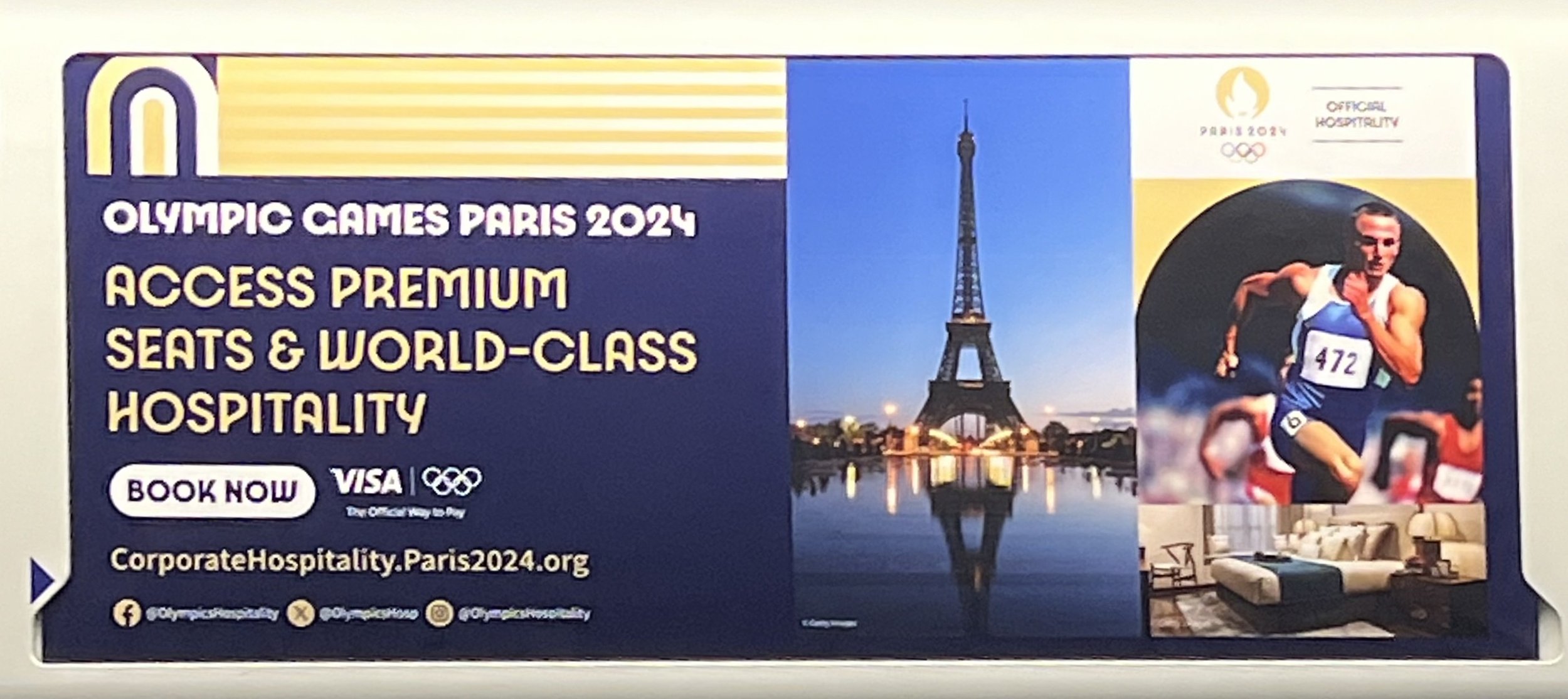
I’ve seen this Ad a few times on the tube lately and it’s really bothered me because it look a little all over the place, and given my recent experience in branding work happening under the pressure of hospitality going on sale for events, felt like redesigning it - using the guidelines I could find online for Paris 2024.
The original tube ad (Sorry about the quality)
So it’s an ad for hospitality for the olympics, fine. There are a few elements to consider (likely contractually), things like the ‘official hospitality’, ‘Visa’ and URL being featured, Otherwise everything else feels up for discussion.
this felt very third party in it’s execution and not like any other olympic branding I’d seen so far, so my first stop was to hunt the guidelines available - and download the font where I could find it.
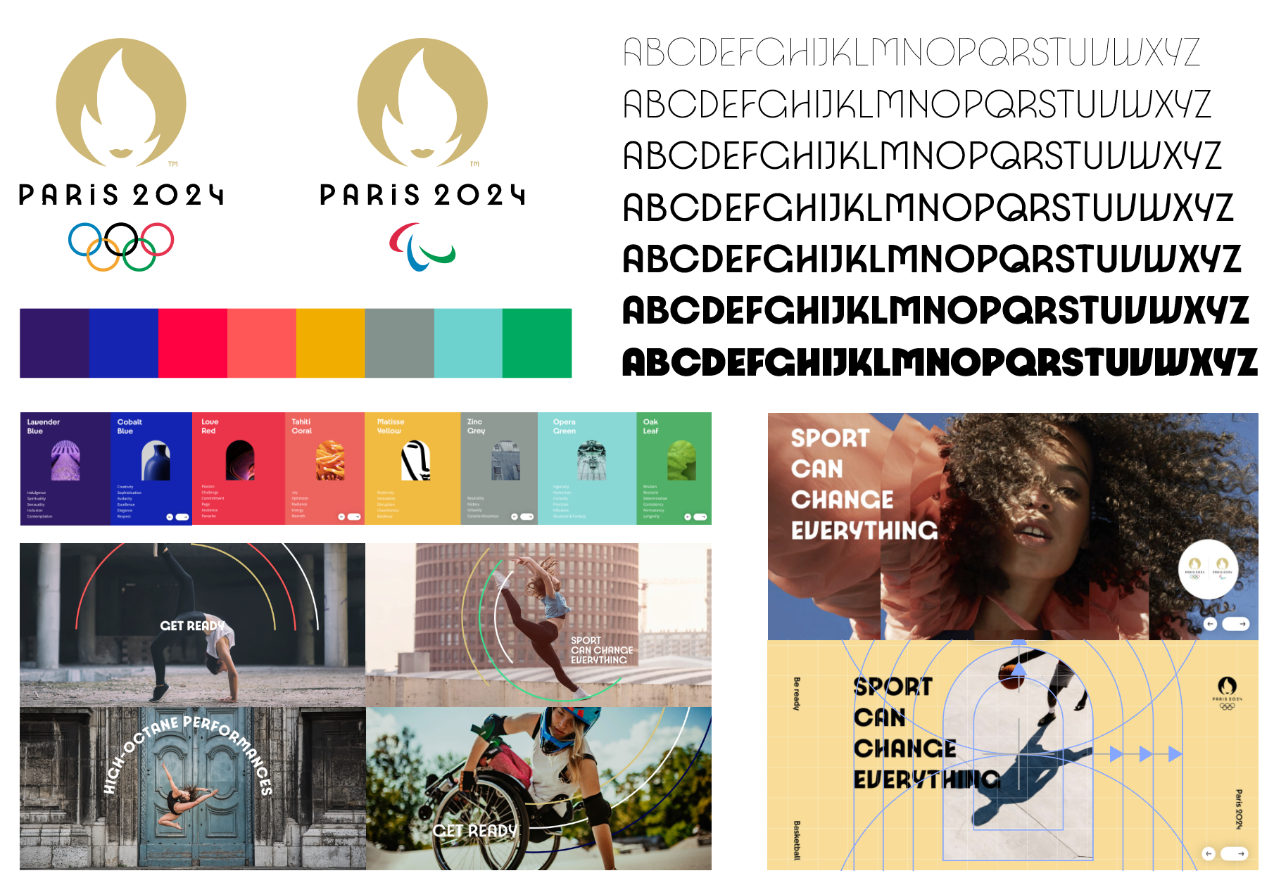
Luckily Paris have a full branding breakdown on their website: https://www.paris2024.org/en/design/ so I built an overview in illustrator to reference and get to work.
Overview of the branding elements and examples of use
So first I went to reworking the ad to the guidelines, including all the elements the original features. The Eiffel Tower, A sport image, a bedroom and added a food image. French cuisine is some of the finest and a big sales pull for hospitality guests. I kept the colours the same for ease.
Rework 01
Stripping the graphic features which don’t exist in the guidelines and made the top of the ad quite messy, and using the arch frame to focus on the hero image allowed for much more room for messaging.
The official hospitality logo feels like it has more space and the grid system worked to align things nicely. Clear and clean. just nothing too exciting. The challenge was featuring other any images than just the hero - so some creative licence in use of the circular frames was taken as a resolution.
Now I did remove the socials featured, I don’t think they added much and if I’m buying hospitality, I’m probably doing through a company or entity, rather than individually.
Fine. Functional. Not very inspiring. Let’s try another way…
rework 02
Flipping the arch to house a second image feels more appropriate than using the circles, we capture two elements and with some little help from Ai, have an athlete on the streets of Paris featured - a lot more aligned to the brand examples. Does it say hospitality however?
Time to lean into the olympic elements more…
rework 03
I love the arch element use in the photos as a way of distortion, as mentioned earlier, the guidelines don’t show much in way of examples to use multiple images, even when framed in the arch. So picking a hero image to try and grab attention on the tube is important, the question is: what’s more important… the Olympics, Paris or Hospitality?
Feeling like the intended audience would probably have an active interest in sports, we see the swimmer used. I removed the ‘Olympic Games 2024’ copy to simplify the amount of information further, in favour of highlighting the olympics and official hospitality logos used in the pill shape for easy recognition.
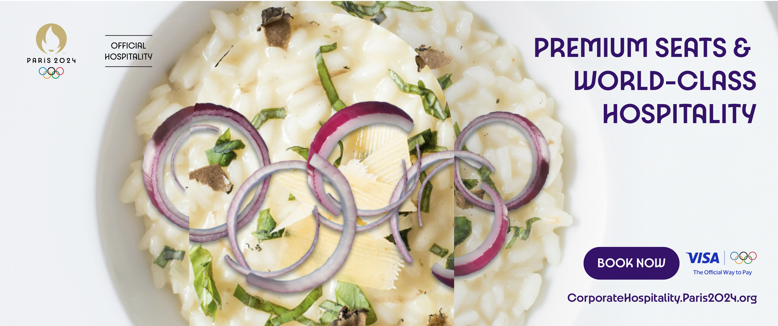
rework 04
To option the same approach using a more hospitality-focused image, I opted to throw a very dirty photoshop job together where the onions formed the olympic rings atop the risotto, with the distortion of multiple arches effect it was getting busy, so reduced to using just one arch.
Last try…
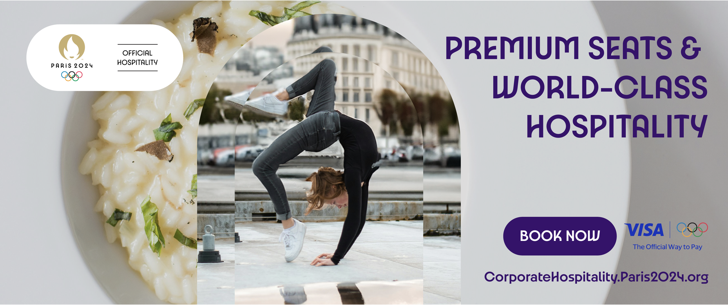
rework 05
I loved the street athlete so much more, and taking creative licence to combine the arch distortion with a background image, I think this works to Capture hospitality, Paris and sport all in one.
I’m not precious, I believe creative can happen 100 ways, but we often have to choose one or two. This is about trying to exercise my skills and create conversation in branding, so feel free to get in touch with your comments and thoughts.
I should also add a big disclaimer that this has in no way been asked for or commissioned by anyone for me to do, so all rights to official logos etc reside with the relevant owners. Images used are all from Unsplash and all fonts, colours and branding images are publicly available off of the world wide web.


